CASE STUDY
Marin Cilic
Preparing for Center Court.
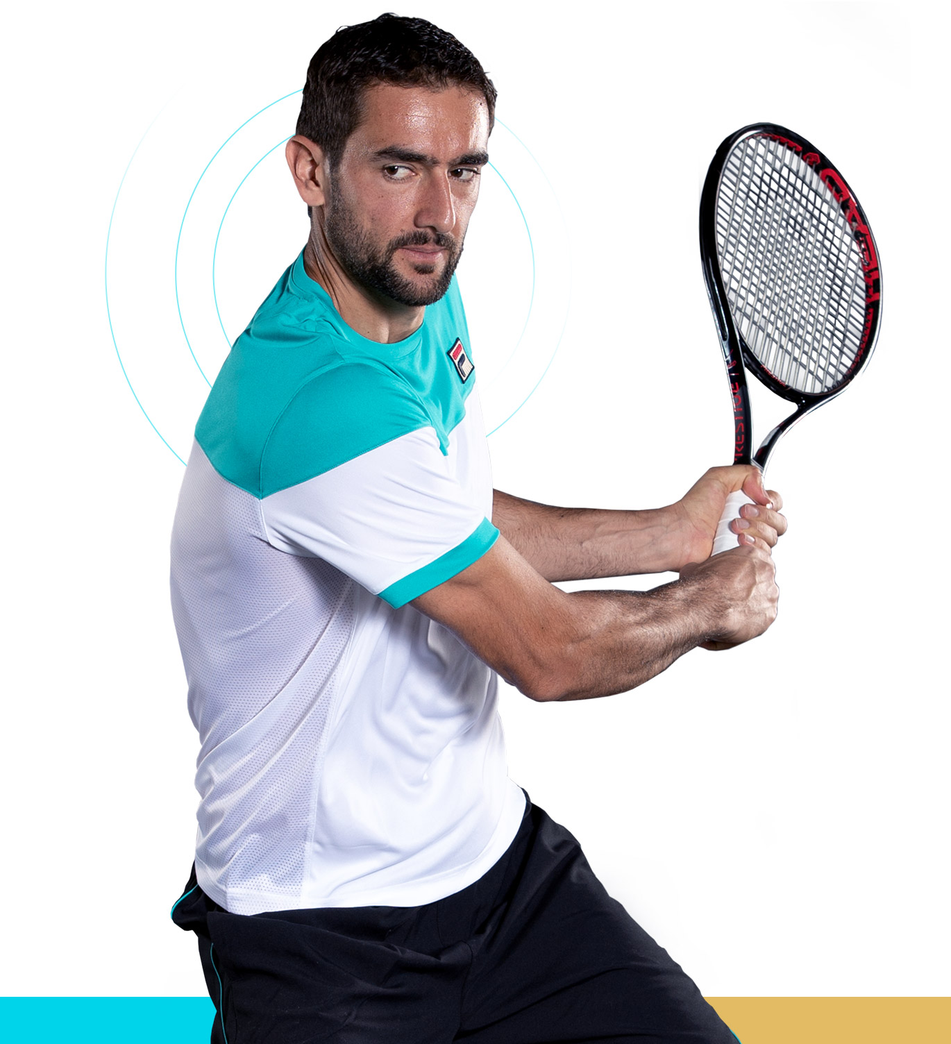
As a 6’6” athlete in the 4th seed of the tennis world rankings, Marin Cilic always stands out. The combination of his powerful style of play and calm demeanor captivates tennis fans throughout the world. Along with Marin’s dedication to his craft, he understands that life goes further than the tennis racket, creating and running his own foundation to help underserved children gain access to sports and after-school programs.
With his tennis game thriving and his foundation changing lives, Marin’s digital presence did not match. Marin came to Brand Knew looking for an entirely new web experience that showcased the complexity of his passions and would put The Marin Cilic Foundation under the bright lights of center court.
The Match Up.
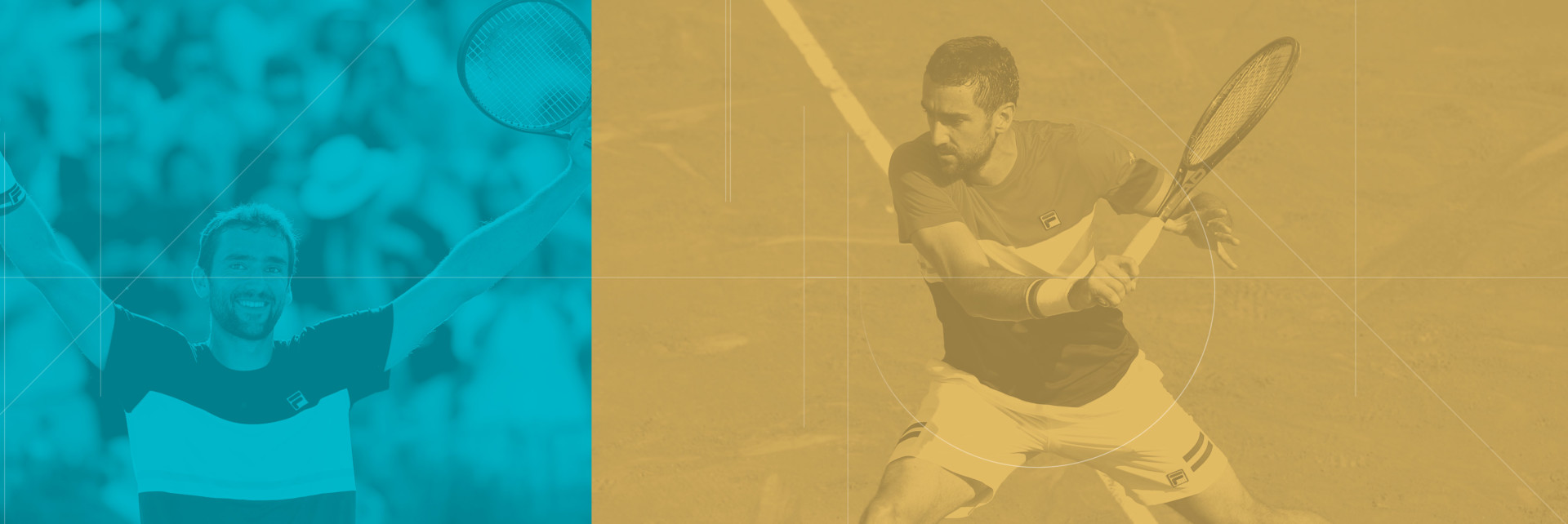
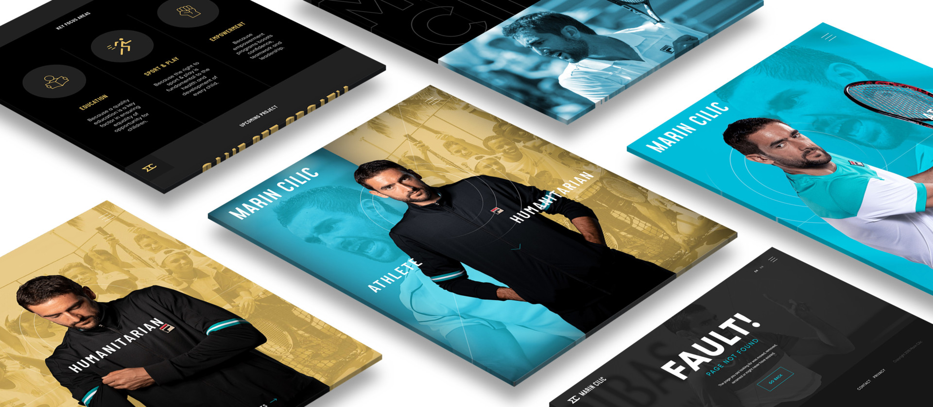
When we began our partnership with Marin, we knew it was important to build a web experience that embraced his calm but powerful presence on the court, while highlighting that he is more than just a ‘jock.’ To accomplish this goal and ensure Marin stood out amongst his competitors online, Brand Knew designed a UI/UX that simply guided fans through the complexities of Marin. Avoiding the typical navigation and architecture for professional athletes’ websites, Brand Knew structured his site to commensurately display the athlete side and the humanitarian side, giving equal prominence and detail to each aspect.
Building upon this unique presentation, Brand Knew enhanced the fan’s experience with parallax effects, smooth horizontal transitions, and compelling animations that brings the website to life. In order to reflect the athlete and humanitarian components that comprise Marin, we married the intensity of black to represent his athletic prowess, with the subtlety of teal to show his compassion. Working with an international athlete, we integrated a toggle that seamlessly transitions copy from English to Croatian (Marin’s native language).
The Ace.
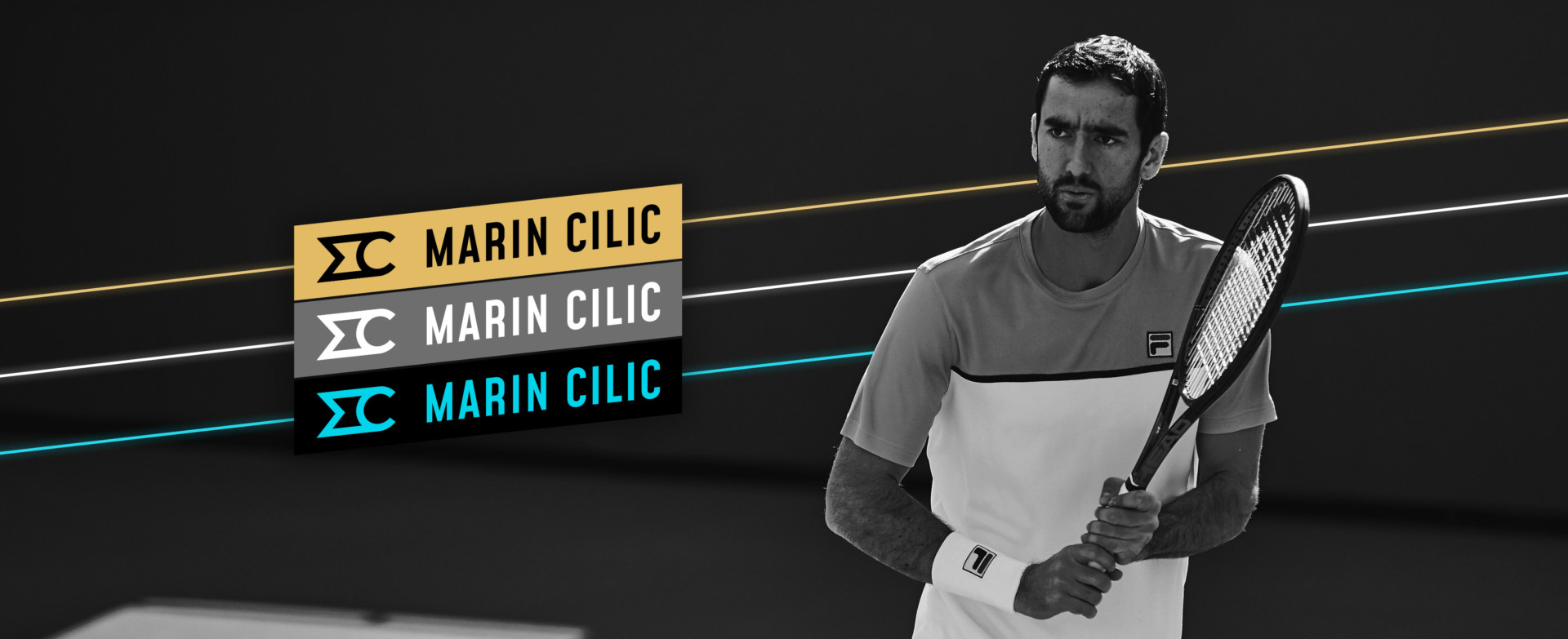
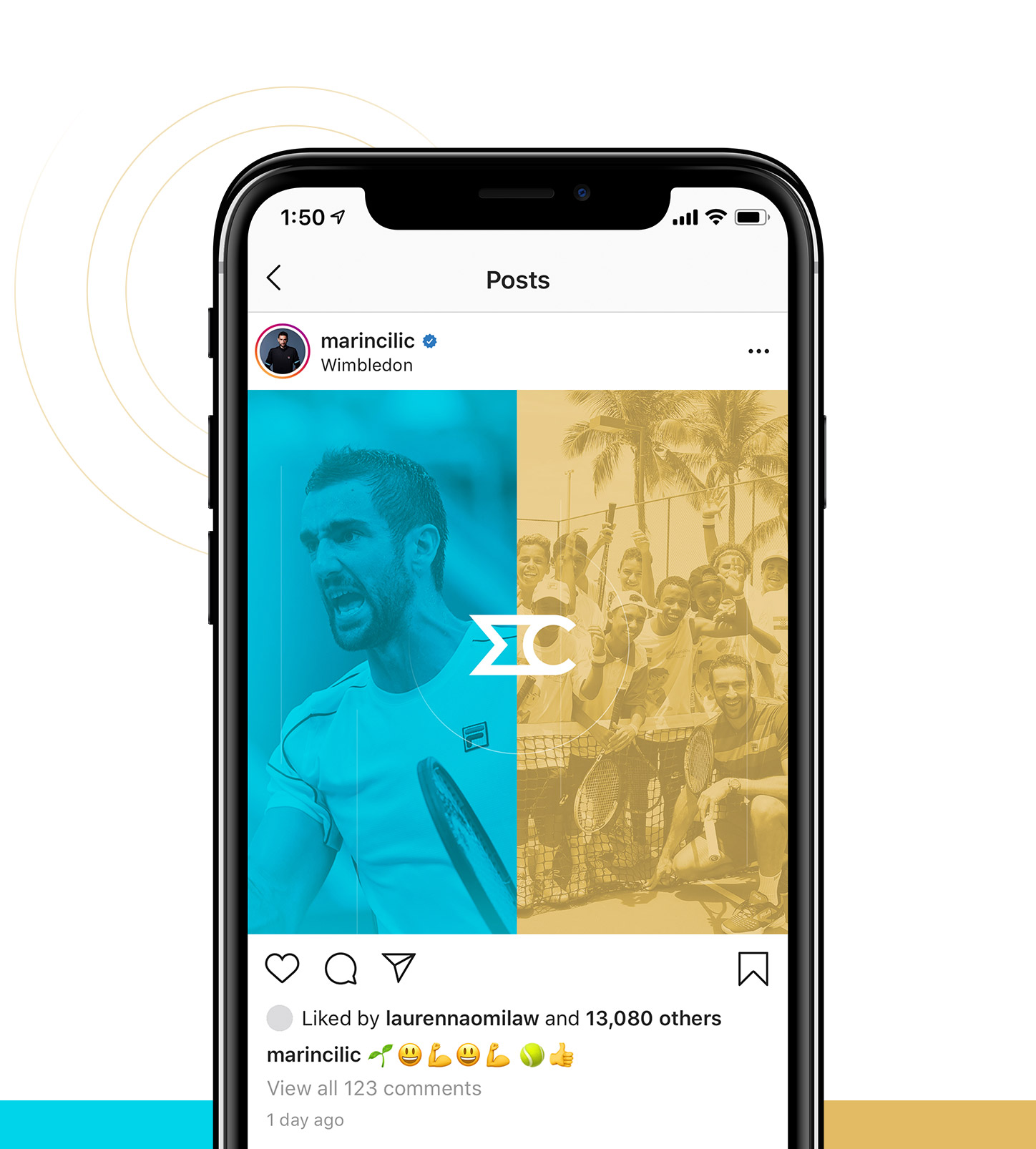
Along with the launch of a fresh new digital presence for Marin Cilic, Brand Knew went beyond the scope to deliver a new brand identity that represented Marin as an individual, as a tennis star, and as a leader for his foundation. Throttling his complex identity through one logo lets the tennis pro build brand value as he competes across the globe for years to come, providing stronger brand recognition for The Marin Cilic Foundation down the road, when he hangs up his racket in favor of philanthropy..
Marin was thrilled with the final result and is now able to focus his efforts on what matters— aces and opportunities. Since launch, data shows his fans and foundation donors are enjoying the experience, with an above industry average duration of time spent on the site and a bounce rate that is 20% lower than other professional athlete websites.
